
Make Your Own Flag With Meaning: Symbols, Colours and Text
Make your own flag with meaning: pick one symbol, two or three colours, and the little text that survives on cloth, then build and print it for free.
By the Flag Maker team
To make your own flag with meaning, start with one idea about your family, your place or your story, turn it into a single large shape, then choose two or three colours you can explain out loud. A flag that tries to hold a whole biography fails. A flag that holds one thing clearly gets flown for years.
The hard part is not the drawing. It is deciding what to leave out.
Start with what you want the flag to say
Write one sentence before you open anything. “We came from the coast and we work with wood.” “This is the house on the hill.” “Our family crossed an ocean and started again.”
One sentence gives you a symbol and a colour pair. Three sentences give you clutter.
If several people are involved, have everyone say their sentence out loud before anyone picks a colour. Families argue about green versus blue for an hour and then work out that they disagreed about the meaning, not the shade.
Then test it. Can a stranger see your sentence in the flag without a caption? They will not get the detail, and that is fine. They should get the feeling.
Turning a place, trade or story into a symbol
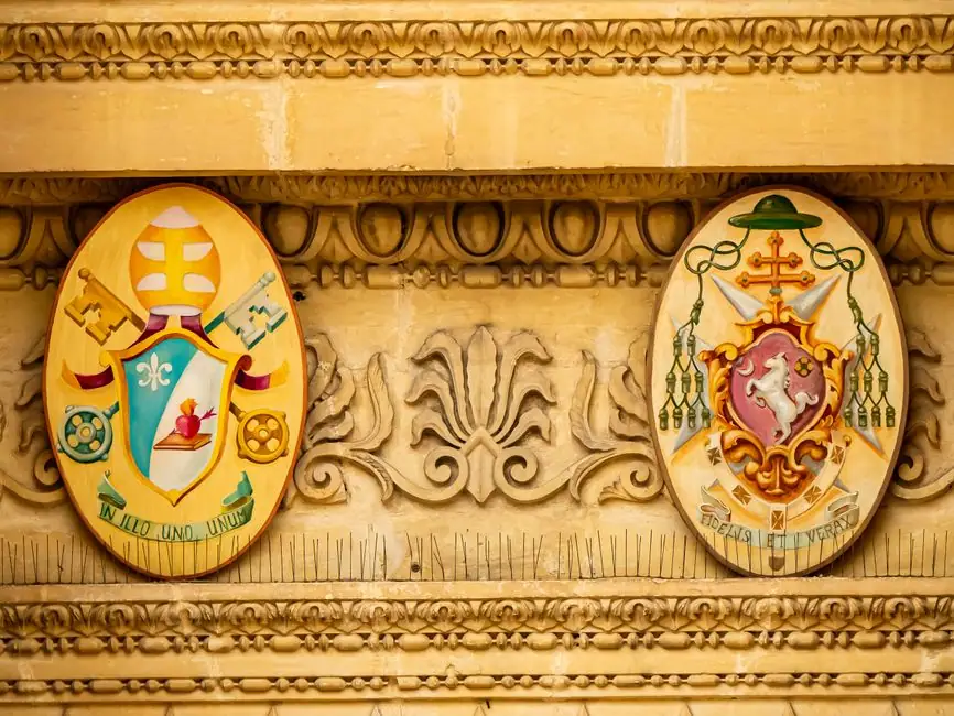
A symbol placed on a flag is called a charge, a term borrowed from heraldry and still used in vexillology, the study of flags. Your job is to find one charge that carries your sentence.
Places give the easiest ones. A mountain outline, a river bend, a wave, a pine, a single star for the town you grew up in.
Trades give the next easiest. A hammer, an anchor, a wheat ear, a needle, a key, a wrench.
Stories are harder, because a story wants narration and a flag cannot narrate. Compress it instead. A crossing becomes a wave or a ship silhouette. A rebuilt house becomes a roofline. A grandmother’s garden becomes one flower, drawn flat, with no shading.
Symbols that survive on cloth
Shapes that work: silhouettes, geometric blocks, stars, crosses, bands, animals drawn as solid colour.
Shapes that fail: family photos, detailed crests, thin outlines, a coat of arms shrunk down, and maps with real coastlines.
Hold your design at arm’s length and look again. Whatever disappears is decoration, and it is costing you the rest of the flag.
Choosing colours with personal meaning
Pick your colours for a reason you can state. Then check what those colours already say to other people, because flag colours carry inherited meaning: red for courage or blood, white for peace, green for land, blue for water or sky, gold for harvest or wealth. Our rundown of what flag colours stand for goes through the common readings.
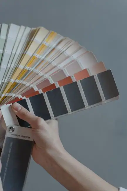
Two strong colours plus one metal, white or yellow, is the classic combination. Heraldry has a reason for that pairing. The rule of tincture keeps colour off colour and metal off metal, so the shapes stay separate at distance. Dark navy on black reads as a smudge from thirty feet.
Three flat colours is a sensible ceiling for a personal flag.
Stripes are a good way to give each colour its own meaning without crowding the symbol. The way pride flag stripes carry meaning is the clearest working example of one colour, one idea.
Skip gradients. Printers handle them, but they muddy at distance and they date quickly.
Names, initials and dates: how much text works
Most people who want a flag design with a name are picturing their surname across the bottom. The honest answer is that text is the weakest element on any flag, and most of it does not survive.
It stops being legible past roughly twenty feet. It prints backwards on the reverse of a single sided flag. It smears in wind.
What does work:
- One or two initials, drawn large as a monogram and treated as a shape rather than as writing.
- A single four digit date, set big in a corner or a bottom band.
- A short surname, one word, heavy sans serif, filling most of the width.
What does not work: full names, mottos, two lines of anything, script fonts, and a tagline under a symbol.
If the words matter more than the flag, make two versions. A clean one to fly, and a text version for a print, a card or a shirt.
Building it in the editor
Order of operations beats talent here.
- Pick the ratio. 3:2 or 5:3 suits a flag meant to fly.
- Fill the field with your base colour.
- Add one division: a band, a stripe set, a cross, a diagonal.
- Place the single charge.
- Add the monogram or date only if step 4 left room.
- Shrink the preview to thumbnail size and delete whatever vanished.
The canton, the upper corner next to the pole, stays visible even when the flag hangs slack. Put the mark you care about most there, or dead centre. The walkthrough on how to make your own flag covers the editor basics.
Doing this with children? Draw on paper first, then rebuild the best one on screen. The classroom flag activity explains why that order gets better results.
Printing it as a wall, garden or desk flag
Decide the use before you export. A wall flag hangs flat and gets looked at from a few feet, so it can keep finer detail. A garden or pole flag needs bold shapes and nothing fragile near the outer edge, which flutters hardest and frays first.

Single sided printing mirrors the artwork on the back, so any initial or date reads backwards. Double sided costs more and solves it.
Leave a clear margin on all four sides. The hoist edge disappears into the sleeve or hem, and a couple of inches of artwork go with it. Our notes on custom flag printing cover sizes, fabrics and what a shop needs from you.
Build it in Flag Maker
Flag Maker is the free editor on the Flag Maker home page. Set your ratio, fill the field, drop in your symbol, and keep pulling things out until only the meaning is left.
Frequently asked questions
How do I make my own flag with meaning?
Write one sentence about your family, place or story. Turn that sentence into a single large symbol, then pick two or three colours you can explain out loud. Build the field first, add one division, place the symbol, and delete anything that vanishes when you shrink the preview to thumbnail size.
Can I put my family name on a flag?
You can, but text is the weakest part of any flag design. A surname only reads if it is one word in a heavy font filling most of the width. Full names, mottos and script fonts turn to a smear in wind, and on a single sided flag they print backwards on the reverse.
What symbols work well on a family flag?
Flat silhouettes and geometric shapes. A mountain outline, a wave, a pine, a star, an anchor, a key, a tool from the family trade, or an animal drawn as one solid block. Avoid photographs, detailed crests and maps with real coastlines, since fine detail disappears on woven fabric at any distance.
How many colours should a personal flag use?
Three flat colours is a sensible ceiling, usually two strong colours plus white or yellow. Heraldry keeps colour off colour and metal off metal, which is why navy on black reads as a smudge from thirty feet. Give each colour a meaning you can state, and skip gradients.