
Best designed flags: what separates them from the worst
See why the best designed flags top every list while others land in the worst pile, which faults sink a flag, and how to grade your own design.
By the Flag Maker team
The best designed flags all do the same few things: stay simple, read clearly at a distance, and work without lettering. Ask ten people for the best designed flags in the world and you get ten different lists, but ask them to name the worst flag design and the answers line up fast. That gap is the useful part. The flags people agree are bad fail in a few repeatable ways, and the flags that sit near the top of every ranking share a short set of traits. This guide scores real flags against those traits, so you can see where a flag design tier list comes from, then grade your own design the same way.
The yardstick most people use is the set of five principles in “Good Flag, Bad Flag”, the booklet Ted Kaye compiled for the North American Vexillological Association: keep it simple, use meaningful symbolism, use two or three basic colors, no lettering or seals, and be distinctive or be related. The five rules and the reasoning behind them have their own guide. This page is about how real flags score against them.
What lands a flag in the worst pile
Bad flags usually fail three tests at once.
The memory test. Can someone who has seen the flag a hundred times draw it? If the answer involves a wreath, a plow, a mountain range and a sailing ship, no.
The distance test. A flag gets read at 50 or 100 feet, half folded by wind. Thin lines and small shapes turn to mush.
The identity test. If you have to check the proportions or the shade of blue to tell two flags apart, the design is doing no work.
The classic worst-pile pattern is a seal on a dark blue field. Many US state flags were built that way, which is why they cluster at the bottom of any ranking. Nobody chose those designs for cloth. Someone took an existing paper emblem and sewed it onto a plain background.
Seals, text and other repeat offenders
Seals and full coats of arms. A coat of arms is made to be read up close on a document, with a shield, supporters, a crest and often a scroll. Shrink it to a thumbnail and nothing survives. Minnesota and Utah both replaced seal-on-blue flags with simple geometric designs, and the new flags are far easier to draw.

Lettering. Words are the fault that gets worse the better the flag flies. They read backwards from the back of a single layer flag, they vanish at distance, and they pick one language. Mottos work on paper and fail on a pole.
Too many colors. Flag fabric comes in a limited palette, and the more colors you use, the weaker the contrast between any two of them.
Realistic pictures. A shaded building, animal or landscape is an illustration, not a symbol. Silhouettes survive being made small. Drawings do not.
Accidental twins. A layout that copies a neighbor by mistake throws away the whole design.
The flags that get ranked highest, and why
The flags that keep appearing on lists of the best flag designs of all time are almost boringly consistent in structure. One idea, two or three colors, large shapes.
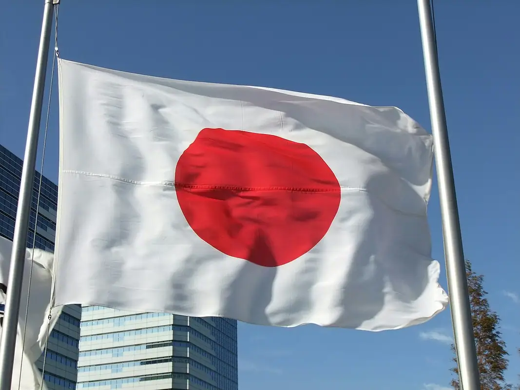
Japan is a white field with one red disc. You could draw it around a coin. Canada has one leaf, one color plus white, and it reads the same from across a stadium. Switzerland is a square flag with a white cross, and nothing else looks like it.
New Mexico is the state-level version of the same thinking: a red Zia sun on yellow. NAVA members ranked it first in a survey of US state and Canadian provincial flags, and it shows the payoff of lifting one symbol instead of using a whole seal. Quebec, Alaska, Texas, Arizona and South Carolina sit near the top of those rankings too. None of them need a caption.
What they share is not minimalism for its own sake. Each has a symbol doing a job: a sun, a leaf, a constellation, a tree. The colors mean something as well, and the meanings behind flag colors are part of why these designs feel specific rather than empty.
What the Good Flag, Bad Flag rankings actually say
The ranking people mean is the North American Vexillological Association’s 2001 survey, which asked members to rate the flags of US states, US territories and Canadian provinces on design quality. New Mexico placed first and Georgia’s flag of the time placed last.
- New Mexico won with a red Zia sun on yellow: one symbol, two colors, no seal and no lettering.
- Georgia’s flag at the time carried a state seal plus a row of small flags and a line of text, which fails the no-lettering and no-seals principle and the memory test together.
- Quebec, Alaska, Texas, Arizona and South Carolina also rated near the top, and each one is a single large symbol or an unmistakable division of the field.
Simplicity against distinctiveness
Simplicity has a limit, and it is the point where your flag stops being yours. There are only so many ways to stack three stripes.
Indonesia and Monaco are both red over white, and the usable difference is the proportions. Chad and Romania are near identical vertical tricolors. The Netherlands and Luxembourg differ mainly in one shade of blue. Ireland and Ivory Coast use the same three colors in opposite order.
So aim for simple and specific. One distinctive shape or arrangement is usually enough: a Nordic cross set off toward the hoist, a disc placed off center, an unusual division of the field. Those Nordic flags resemble each other on purpose, which is the other half of the principle. Borrowing a color family to signal a connection is a decision. Matching another flag by accident is a mistake.
Complex flags that work anyway
Plenty of busy flags score well, and they break the rules in the same way.
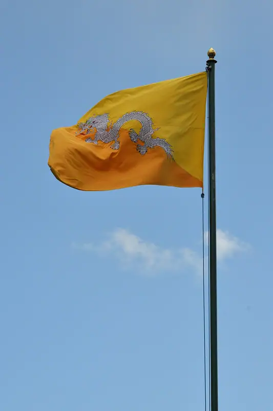
Wales and Bhutan both put a detailed dragon on the field, but the dragon fills the flag. The outline stays unmistakable even when the detail blurs. Nepal is the only national flag that is not four sided, and two stacked pennants beat any amount of simplicity for recognition. Mexico and Portugal carry intricate central emblems, yet both still read because the bands of color around them do the identifying from a distance. South Africa uses six colors, twice the recommended limit, and works because a single Y shape organizes all of them.
The pattern: complexity survives when one large form dominates and the silhouette is unique. It fails when the detail is scattered into small pieces across the field.
Grading your own design the same way
Score your design out of 10. Two points for each principle, where 2 is a clear pass, 1 is partly, and 0 is a fail.
- Simple enough to draw from memory
- Symbolism that relates to the place, group or idea
- Two or three basic colors with real contrast
- No lettering and no seal
- Distinctive, or related to another flag on purpose
Eight or more and you are in good shape. A six or seven usually has one fixable problem, and most often it is the color count or a leftover piece of a logo. Below that, restart with one symbol and two colors.
Then run three checks on the actual file. Shrink it to thumbnail size and see if it still reads. Put it away and draw it from memory. Convert it to grayscale to find out whether your colors were carrying the contrast or hiding the lack of it. Check the shape too, since a design built for a square behaves differently at the proportions countries actually use. The short answer on what makes a good flag is a quick refresher before you score.
Score your design in Flag Maker
The fastest way to settle a ranking argument is to rebuild the flag and look at it small. Open Flag Maker on the home page, pick a ratio, build your field and symbol, and export a PNG or SVG. Shrink the preview, then redraw it from memory and compare. If the two versions match, your design has the one thing every top ranked flag has.
Frequently asked questions
What is considered the worst flag design?
The pattern that lands at the bottom of most rankings is a detailed seal or coat of arms placed on a plain dark field. It was drawn for paper, so it disappears at a distance and nobody can draw it from memory. Lettering, mottos and realistic pictures with fine shading fail for the same reasons.
What are the best flag designs in the world?
The flags that keep topping best-of lists share a structure rather than a style: one main symbol, two or three colors, and large shapes. Japan, Canada and Switzerland are the usual examples. Among states and provinces, New Mexico, Quebec, Alaska, Texas and Arizona are regular picks for the same reason.
How are flag designs ranked?
Most rankings apply the five principles from the booklet Good Flag, Bad Flag: keep it simple, use meaningful symbolism, use two or three basic colors, avoid lettering and seals, and be distinctive or deliberately related. Score a flag out of two on each principle and you get a rough tier list that matches how people actually judge flags.
Can a complicated flag still be a good flag?
Yes, when one large form dominates and the outline is unique. Wales and Bhutan both carry a detailed dragon, but it fills the whole field. South Africa uses six colors and still reads because a single Y shape organizes them. Complexity fails when the detail is scattered into small pieces.